Using Metrics to Manage Flow
Originally published March 2025
Building on the Managing and Measuring Flow article, this article takes a closer look at three essential metrics for managing flow: the Cumulative Flow Diagram, the Cycle Time Distribution Chart, and the Item Aging Chart.
The Power of the Cumulative Flow Diagram
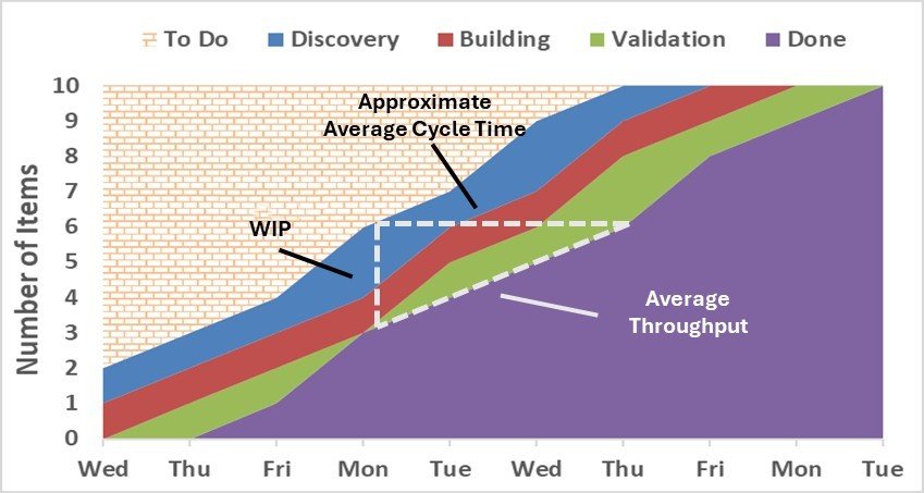
The Cumulative Flow Diagram (CFD) tracks work items as they flow through the workflow stages of your Scrum or Kanban board. It should be kept in mind that a CFD is not a predictive tool; rather, it helps teams analyze past flow patterns to assess the health and stability of the system. To create this powerful visualization, plot the number of work items (y-axis) in each workflow stage along a regularly recurring timeline (usually each day) along the x-axis. Each band in the CFD corresponds to a workflow stage on your board, with the bottom band representing an accumulation of all finished work.
The secret sauce to a CFD is the three additional flow metrics “hidden” within it. They are WIP (Work in Progress, Approximate Average Cycle Time, and Average Throughput. Let’s use the diagram below to examine the interconnection of these metrics within the CFD.
WIP. WIP is the vertical distance (read against the y-axis) between the tops of any two bands. In this example, we are looking at the total WIP on the Kanban or Scrum board. On Monday, there are approximately three total work items that day (6 items - 3 items).
Approximate Average Cycle Time. We can also see that any item brought into the Discovery stage on Monday will finish (on average) three days later. That happens to be Thursday in this example.
Average Throughput. Throughput is the rate of items completed which can be found by taking WIP over Cycle Time. In this example, that would be three work items over three days. We can say that during the timeframe in question below, one work item (3 over 3) was being completed each day (on average).
When reviewing a Cumulative Flow Diagram (CFD), a healthy system is indicated by parallel bands moving steadily upward, showing that work is progressing smoothly through the workflow. However, certain patterns in the diagram can signal potential issues that need attention.
Widening bands suggest that work is accumulating in a stage, leading to an increase in Work in Progress (WIP). This directly impacts Cycle Time, causing work items to take longer to complete. If a band is expanding, teams should investigate whether bottlenecks, resource constraints, or other factors are slowing the flow.
Flattening bands indicate that work items are not exiting a particular stage in a timely manner. This could mean that tasks are stalled due to dependencies, blockers, or inefficient processes. If this pattern persists, teams should assess why work is getting stuck and whether process improvements or WIP limit adjustments are needed.
Disappearing bands may suggest that work is skipping certain stages entirely, potentially signaling an issue in how work flows through the system. If a stage is rarely or never used, it may be worth re-evaluating the workflow to determine whether that step is necessary or if the team’s process has evolved beyond it.
Regularly reviewing your Cumulative Flow Diagram (CFD) helps ensure a stable, efficient workflow by highlighting trends, bottlenecks, and areas for improvement. By understanding the hidden flow metrics within the CFD, teams can make data-driven decisions to optimize delivery and maintain predictable progress.
Cumulative Flow Diagram
Predicting Delivery with Cycle Time Distribution
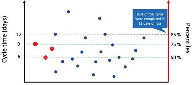
The Cycle Time Distribution Chart (CTDC) tells the story of your delivery predictability by showing how long individual work items take to complete and then aggregates this information into completion percentiles. This powerful tool helps teams set realistic expectations and make reliable delivery commitments.
The graph is constructed by recording the amount of time each work item takes to finish (a.k.a. Cycle Time) once it has started. As each work item completes, a new dot is placed to the right of the preceding dot at the appropriate cycle time shown in the left y-axis. In the graph below, the first, second, and third work items were completed in nine, six, and eight days, respectively (see red dots).
On the right y-axis, we can see that out of the 24 completed work items, half (50%) finished in six or fewer days, 75% finished in nine or fewer days, and so on. We now have a confident response to the long-asked question, “When will it be done?” Based on this data, we can now pick a confidence interval and report the number of days for that interval. For example, we can confidently say that 85% of the time, any new work item started will be completed in 12 or fewer days. The team and the client need to find the confidence interval both can agree to work with. † This could be established as a Service Level Expectation (SLE) – a prediction based on historical data when a work item is expected to complete. As you implement process improvements, watch your distribution – it should shift down (faster delivery) as your process improves.
Another critical yet often overlooked benefit of the CTDC is it reflects the true nature of your workflow without requiring estimates or guesses. Since the CTDC uses actual completion data, there's no need to estimate, guess, or spend significant time planning how long work items might take. Importantly, this eliminates the necessity for using story points! When considering a new work item, simply ask, "Will this likely exceed the agreed-upon confidence interval?" If the answer is yes, consider breaking the item down further; if not, it's ready to start.
† What if the client insists on a 100% certainty interval? Unfortunately, absolute certainty isn't feasible in complex knowledge work due to inherent uncertainty, complexity, and variability. Therefore, adopting a probabilistic forecasting approach is crucial. This may require some explanation and coaching to help others understand its value. Ultimately, it's far better to be approximately right than precisely wrong!
Cycle Time Distribution
Understanding the Power of the Item Aging Chart
The Item Aging Chart is a powerful tool for tracking how long work items have been in progress and comparing them to historical cycle times. It provides a real-time snapshot of work as it moves through the system, helping teams identify which items are on track and which may need attention. By reviewing this chart daily, teams can spot potential delays early and act before work falls behind.
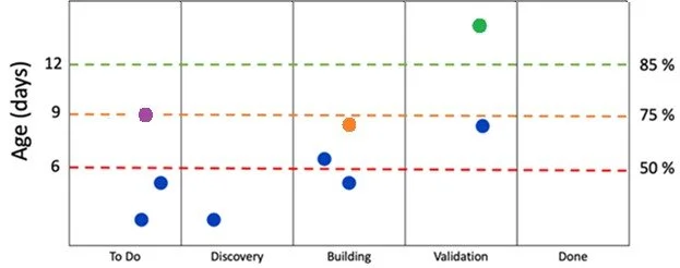
Take a look at the image below. The x-axis lays out the workflow stages from left to right. These stages should be the same as used in the Kanban or Scrum board the team manages to track its work items. In the example below, each current work item appears as a dot above its current stage.
On the left y-axis, we see the Cycle Time age of current work items measured in days. This tells us how long each active item has been on the Kanban or Scrum board. Think of it as a "right now" snapshot of work aging. For example, if you see a dot at 11 days in the "Discovery" column, it means that item has been on the board for 11 days and has made it no further than “Discovery.” The right y-axis shows us something different but complementary: the cycle time distribution of previously completed work items (as described in the Cycle Time Distribution Chart above).
When you read these elements together, powerful insights emerge. In the chart below, when you see a work item at 10 days in the "Discovery" stage, we can probably conclude that this item is not on track to finish within the timeframe of what 85% of most items finish (since 85% finish within 12 days. Remember, this item still must go through two more stages before it gets to Done). However, if an item is at two days in the Discovery stage, there’s probably no cause for alarm; we know half (50%) of items finish within six days and it’s only been two so far. Though it’s in the Discovery column, it’s only been two days.
Now it’s your turn. What would you say about the orange work item in the image below? We know it’s in the Building stage and it was started eight days ago. It’s probably not going to finish in nine days (which 75% of items do), but it still may be poised to finish within 12. If you have an internal goal or an SLE (Service Level Expectation) of finishing your items at the 85% confidence level, this is the perfect item to flag for discussion when meeting with your team. You have four more days to meet your SLE. Are we on track to getting it done in four days? Is anything slowing it down?
Of course, this may not be the item that deserves the most attention. Look at the green work item below. This item appears to be in trouble. Why? It’s been on the board for about 14 days, clearly missing the 12-day mark (and not meeting the SLE) and now belongs to a group of work items that take longer than 85% of completed work. Though they are in the last stage before completion (Validation), this item is aging past a comfortable territory and needs to be addressed right away.
One thing to keep in mind when looking at an aging chart is to remember that just because an aged item is in a specific column, that does not necessarily mean it was that column that caused the aging. Look at the purple work item below. Nine days have already elapsed, and it has moved no further than the To Do stage. Even if this item takes three days to move to Validation, it will still be at the 85% percentile. Maybe the green work item suffered a similar fate – most of its aging could have taken place in a stage prior to Validation. A snapshot of the aging chart does not tell you how long each item elapses in a particular stage (except the first stage, of course). This is why it’s important to review the aging chart each day so you can track movement of work items against past-history cycle times.
The aging chart helps teams identify not just where work is aging, but whether that aging is unusual compared to historical patterns. It's like having both a current snapshot and a historical reference guide in one visualization. This helps teams make better decisions about where to focus their improvement efforts and when to intervene on aging work items. It's not just about seeing how old things are – it's about understanding whether that age is expected or problematic.
Item Aging Chart
Putting It All Together While each metric provides valuable insights independently, their real power emerges when used together. Regular review of all three metrics helps teams spot trends, make data-driven improvements, and maintain healthy flow. Remember that metrics should guide improvement but never become targets themselves – the ultimate goal remains delivering value through smoother, more predictable flow.